Breath and Memory
The Evolution of An Artwork
‘Breath and Memory’ recollects a time when, as a young child, I used to wander the forests near my home in Scotland and find a tree to hug! It speaks to my love of the outdoors and my life-long dream of going to art school. It is the result of three years pursuing my passion for printmaking alongside eleven other women at the Ottawa School of Art (OSA) in Canada. It reflects my desire to challenge myself, in this case, to create an incredibly detailed linocut on a large-scale.
The Artwork:
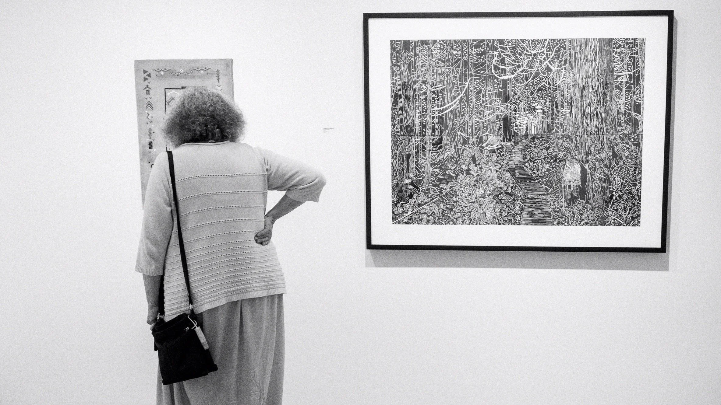
‘Breath and Memory’ is a 36” x 48” limited edition linocut print comprised of four 18” x 24” separate panels printed on white BFK Rives paper with Gamblin Portland Intense Black relief ink. I framed one print from the edition. You could see it on display at the OSA Fine Arts graduation exhibit, ‘Eleven,’ held in June 2022.
My Inspiration:
I am inspired by a variety of printmakers including the historically famous Albrecht Dürer (1471–1528) and Käthe Kollwitz (1867 – 1945) and my contemporary colleagues Adran Gor and Anna Williams, located in Canada; and, other contemporary printmakers posting on social media forums, such as UK-based printmaker Aga Kubish.
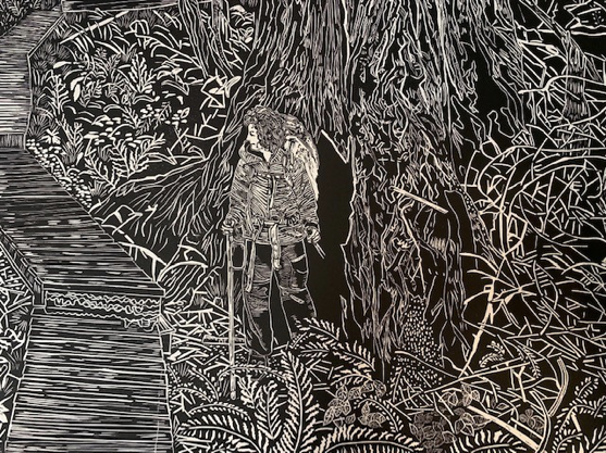
It is during a viewing of Anna William’s solo exhibition ‘Untold Stories I Once Wished Lost,’ I became interested in carving a large-scale linocut and experimenting with finer linocut tools and an expanded repertoire of mark-making. The image I selected as my inspiration is a photograph taken by my eldest daughter, photographer, Ciara Kilpatrick during our backpacking adventure in British Columbia. She captured me in a moment of awe, standing beside a towering old growth tree, looking back along the path we had just traversed.
In terms of mark making, while I admire the realistic detail achieved by Dürer, I prefer the more spontaneous, even ‘raw’ approach of Kollwitz’s carving style and decided my approach would be to build a design giving the feel of my experience on the West Coast Trail, rather than to create a detailed replica of the original photograph. Inspiration for specific types of linocut mark making came primarily from Anna Williams and Aga Kublish who both have tackled large-scale forest scenes.


My Design:
In ‘Breath and Memory,’ I highlighted the lone figure by ensuring the portion of the tree directly behind it is dense black. My aim was to engage and lead the eye of the viewer through the piece, and through the narrative with a combination of marks intended to look like wind and a winding wooden walkway that almost wraps around the figure, then decreases in size and ends at an open, fully carved section that is appears to be a portal out of the forest.
To create visual interest for the viewer, I experimented with new, diverse mark making (i.e., varieties of line densities and styles for plants and branches). By varying the marks from extremely fine, detailed work to more loose, broad carving strokes, I intended to create the feeling of density and movement within a forest. The former, especially the fine detail, to bring attention to focal points: the figure, the central tree, and the walkway.


My Process:
My multi-step process to create this large-scale artwork took four months and included:
Enlarging the original photo and having it printed as 36” x 48” engineering draft paper.
Transferring that image with a charcoal rub to four 18”x24” linocut panels.
Re-drawing and adding detail to the resulting four panels with fine sharpie markers and adding tonal variations to the images with India ink.
Using a new set of the finer ‘Flexicut’ tools to carve the resulting drawings.
Experimenting with diverse types of black relief inks, roller sizes, and paper types to create test prints, artist proofs, and then, finally a limited edition of 4 prints of four panels each.
Taking one edition to Patrick Gordon Framing where he and his team did an excellent job uniting and framing four panels as one image!
Printing this artwork proved to be my biggest challenge as I needed to ensure consistency across all four panels so that they would match with no differences in the ink’s coverage and density. The keys for me proved to be using Gamblin’s Portland Intense Black relief ink, a mid-sized rather than a large roller to apply the ink, and the finer BFK Rives printmaking paper. The latter held ink despite my not soaking it which size prevented me from doing!
You may see my process steps and my joy at seeing the framed print on display in the accompanying photographs.
Please do reach out to me by email using the Contact Page if you have any questions, comments, or are interested in purchasing one of the ‘Breath and Memory’ editions!