Printmaking’s Magic
Do You Delight in Surprises? Printmaking may be for you! To illustrate the diversity and wonder of this medium, let me lead you through the making of my artwork ‘Emergence.’
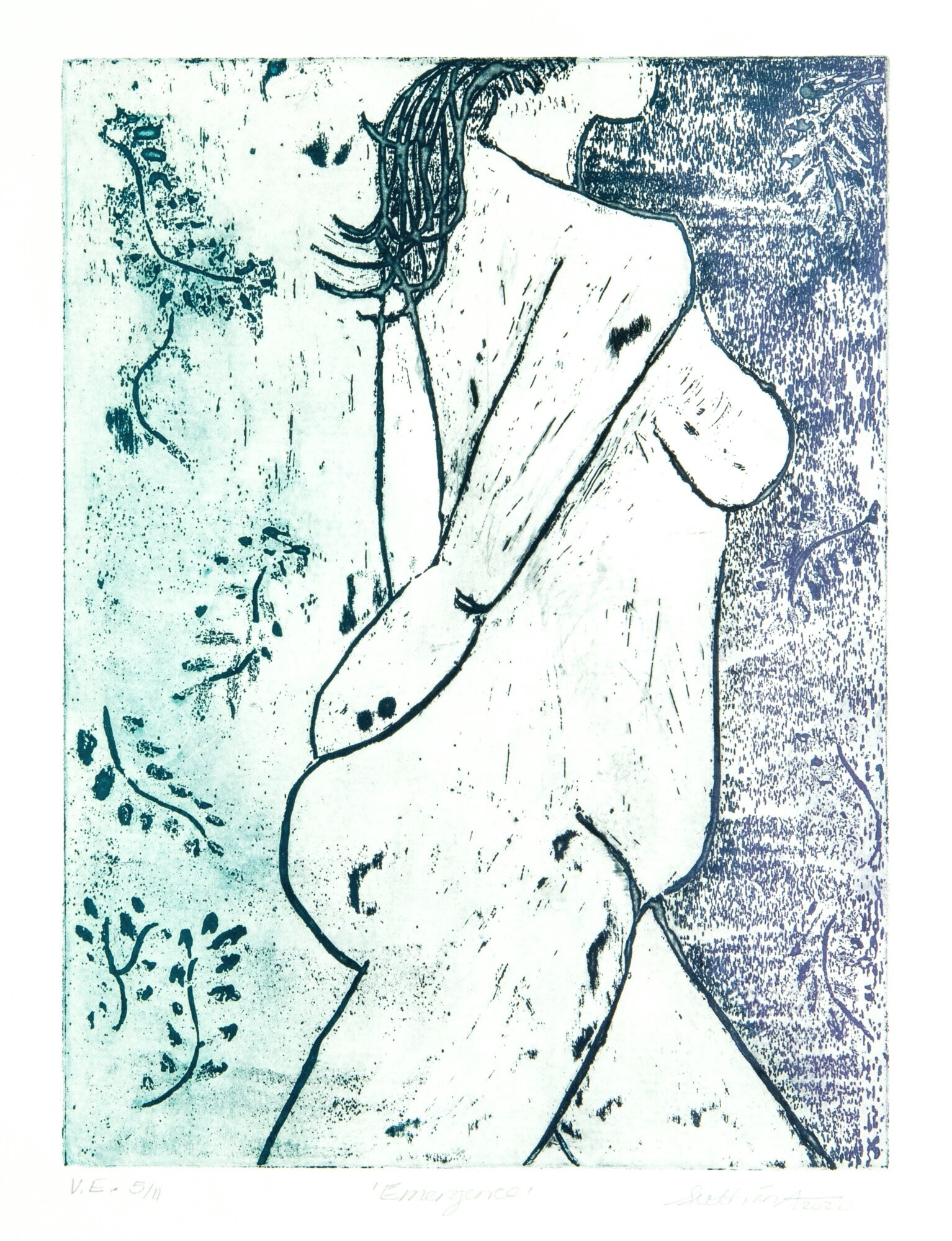
The series ‘Emergence’ is a variable edition sugar lift etching with colours introduced through À la poupée (‘by the dolly’), multi-viscosity and rainbow roll techniques so it is a wonderful way to introduce people to the multi-varied nature of printmaking.
If you are new to printmaking, the term ‘Intaglio’ may not be familiar to you. This word derives from the Italian word ‘intagliare,’ meaning to “carve or cut into” and covers the largest number of printmaking techniques including, but not restricted to, etching, drypoint, aquatint and sugar lift. Intaglio refers to an image produced below the surface. Line etching, for example, may be achieved by lightly drawing an image with an etching needle on a metal plate (e.g., zinc, aluminium) which is covered by a waxy, acid resistant substance called ground. The metal plate is then etched in an acid bath before being cleaned and made ready for printing.
A reverse image print is then made when the plate is inked, wiped (with ink only remaining in the recessed lines), and run through a printing press with a piece of damp paper.
I discovered Sugar lift is a more painterly-like approach to creating an etching. After degreasing the metal plate, I applied a mix of sugar and India ink with a small amount of warm water (i.e., to help dissolve the sugar). I then used an old paintbrush to recreate the figure of a woman I had drawn in a life drawing class. Depending upon the marks you want to create, you can also use a toothbrush, tarlatan cloth, rags or other tools. Once the image was complete, I then applied hardground to the entire plate and let it dry. This provides an acid resist. Once the hard ground was completely dry, I rinsed the plate in warm water letting it slowly take away the sugar lift mixture to reveal my image. A surprise awaited!
My desire was to create an image of a woman walking into a forest and speaks to one of the main themes of my artwork, finding strength and solace in nature. While she emerged with the hints of the foliage intact; she appeared to be lost in the shade as the plate was covered in little grey specks! It seems my eight attempts at painting the figure (!) which required cleaning the plate each time had left their mark: literally! This required a slight pivot. Instead of etching the plate right away, I took the time to paint hard ground over the specks I wished to erase leaving those I felt could work to my advantage; that is, a shaded area to her right, which intensified the feeling of her heading into a forest.
One I had a final image, I placed the zinc metal plate in a copper sulphate etch (i.e., saline solution, copper sulphate and salt mix) which is known to be a less toxic etching solution. The chemical reaction does make you question this, however, as it results in what looks like a deep read algae covering your plate! While my figure acquired a few tattoo markings on her arm, she emerged relatively unscathed. And that is the joy of printmaking, there are always surprises especially when you are learning a new technique.
Printing a sugar lift etching requires ink to be added to the metal plate, the ink wiped off the top of that plate, dampened paper laid on top and then run through the press to create a reverse image. To create my variable edition, I experimented over the course of several weeks with three different processes which I introduce, in brief, below.
À la poupée (‘by the dolly’)
I first applied colours to distinct areas of the plate using stiff pieces of cardboard to force the ink into the etched recesses. Then, I took small pieces of tarlatan, which may be tied to look like a small doll and used individual ones to wipe first the lighter and then the darker colours of ink. Ideally, you want to minimize the colour mixing. In the final step, to clearly delineate the different areas of the plate, I wiped it clean using old phone book pages. In my artwork, I applied Sepia for the outlines and the complimentary colours, turquoise and purple for the background forest and shadows.
Rainbow Roll
In the second series of ‘Emergence,’ I created a rainbow or gradient roll to create the effect of the figure waking through the forest at sunrise or sunset. This is a fun technique.
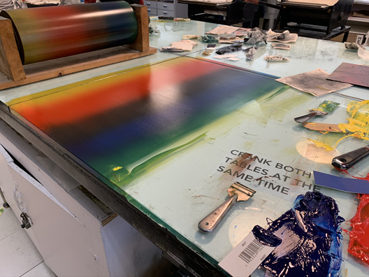
To get prepared, you first place five different colours of ink mixed with easy wipe on a glass-topped surface. We chose yellow, red, sepia, blue and yellow. I then inked and wiped my plate, to fill my image with sepia ink. Then, I took a hard roller and rolled it over the coloured inks once before moving it slightly to the right to blend them during my second roll. This creates what is called a ‘gradient blend.’ I decided to roll my plate from the side so that the figure’s legs were covered in sepia and blue and her shoulders in the lighter colours. As a result, it appears that sunlight is touching down on her shoulders.
Multi-viscosity
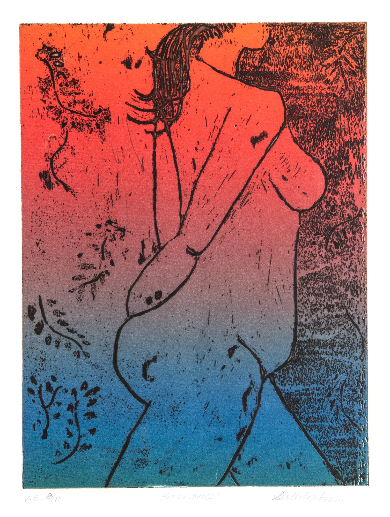
In my mind, the multi-viscosity technique led to the most successful prints in the ‘Emergence’ series. This technique is credited to being developed by Stanley William Hayter in the late 1960’s in Paris which is based on the principle of viscosity (i.e., the characteristics of fluid to resist flow) to print multiple colours of ink from a single plate, rather than relying upon multiple plates for colour separation. The process includes the following steps:
High viscosity ink is applied to the etching plate as with any intaglio etching process so that the ink goes into the recesses, or lines, and the plate is wiped clean (I used process blue ink)
Thinnest viscosity ink is created by mixing ink with triple zero oil which is lightly rolled across the plate with a hard roller (I used process yellow)
Thicker viscosity ink which is created by mixing ink with a stiffening agent (i.e., magnesium carbonate powder) and applied with a soft roller (I used a process ink mixed to create burgundy).
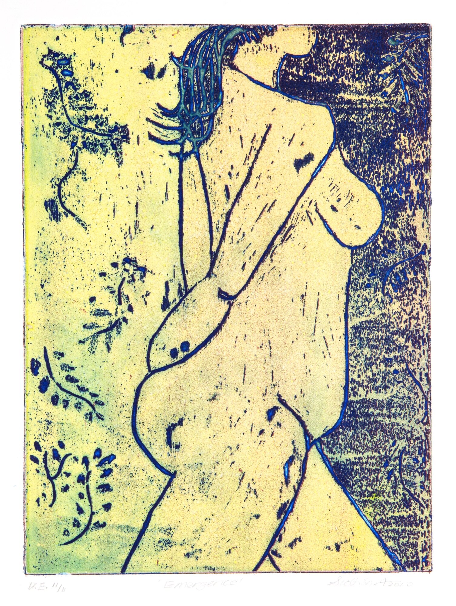
In my understanding of this process, what happens is the thinnest viscosity ink, or oily top layer, repels the heavier ink. Since the thickest ink is applied with a soft roller, it is forced into the indentations of the middle layer (e.g., blue ink in my case). The variety in viscosities of the rolled-on inks prevent them from mixing. What appeared to result in my series ‘Emergence’ is that the figure appears to be bathed in sunlight (yellow with muted greens) as she approaches the shaded forest (green enhanced with burgundy) and her hair has a beautiful sheen (almost a cobalt blue).
Thank you for going on this printmaking journey of exploration with me. Do let me know what you think of the above techniques and the resulting images! Get in touch to tell me if you have tried them before and what results you achieved!
If you are interested in learning more about printmaking, I recommend you take a course at the Ottawa School of Art and/or read the book ‘The Complete Printmaker’ by John Ross, Clare Romano, and Tim Ross. It is invaluable!